


The InsuraCore header is a Theme Builder template built mostly with Elementor’s new V4 (Atomic) elements. A few classic widgets are used where they work better. This guide shows how to open the header, what each part is, and how to edit it safely.
Note: The screenshots are for explanatory purposes. Your header may look slightly different.
1. Open the Header template
You can open the header in two ways:
- From the toolbar: go to Toolbar > Edit with Elementor > Header. The template name may differ.
- From the dashboard: go to Elementor > Theme Builder > Header, then click Edit with Elementor on the Header template. Read more here: https://elementor.com/help/header-site-part/
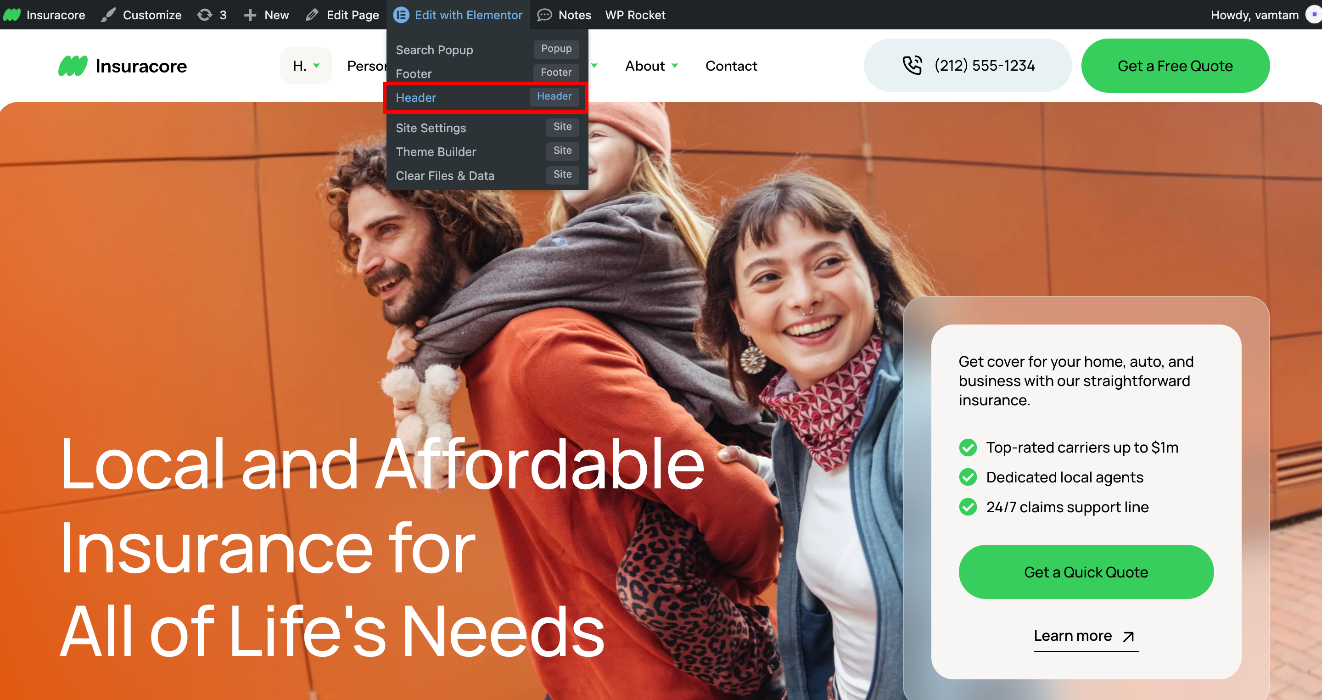
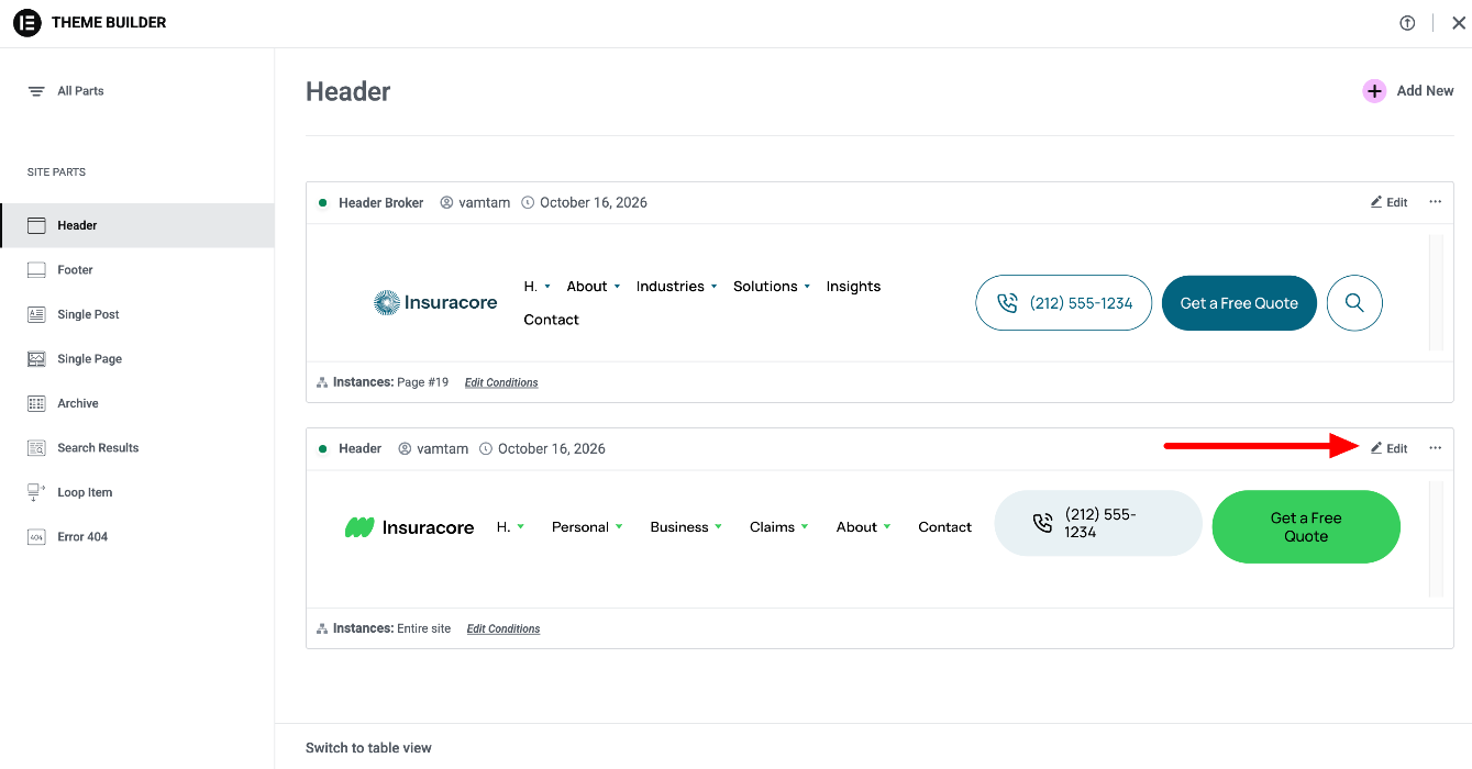
The header is assigned to the entire site, so any change you make here appears on every page. To check or change where it appears, click the arrow next to the Publish button and select Display Conditions.
Read more here: Create or modify your header · Set conditions for site part templates
2. What’s inside the header
The header mixes two types of elements, and each type is edited a little differently:
- V4 elements have a Classes field at the top of their Style tab.
- Classic widgets have the familiar Content, Style and Advanced tabs.
| Part | Element | Type | Where to edit |
|---|---|---|---|
| Header wrapper | Flexbox named “Header” | V4 | Style tab |
| Logo | Site Logo | Classic widget | Image: Site Settings > Site Identity. Size: widget’s Style tab |
| Main navigation | Menu | Classic widget | Content tab > Menu Items |
| “Overview” link in each dropdown | Button | V4 | Element settings (text and link) |
| Link lists in the dropdowns | WordPress Menu | Classic widget | Appearance > Menus |
| Phone number | Button with Icon (Component) | V4 Component | Component fields: Text, Link, Icon |
| “Get a Free Quote” button | Button with the button-primary class | V4 | Element settings; look comes from the class |
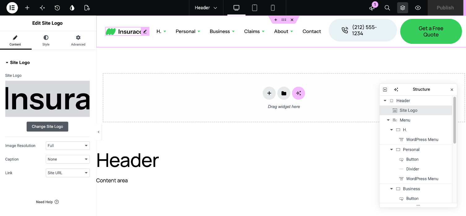
Tip: Click the Structure/Navigator icon (which looks like layers of pages) in the Elementor editor bar or panel. Alternatively, press Ctrl+I (Cmd+I on Mac) to open the Navigator. It’s the easiest way to select elements inside the header and its dropdowns.
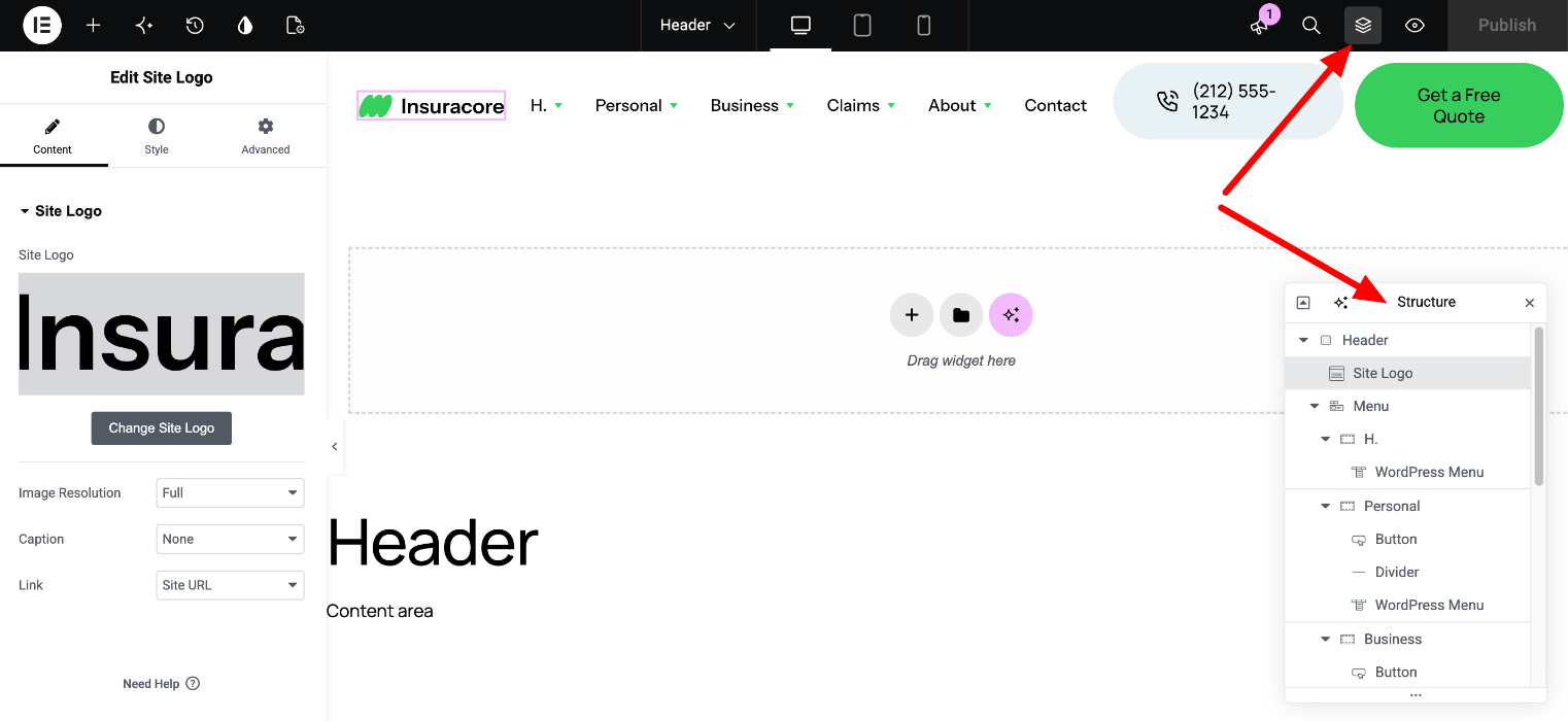
3. Change the logo
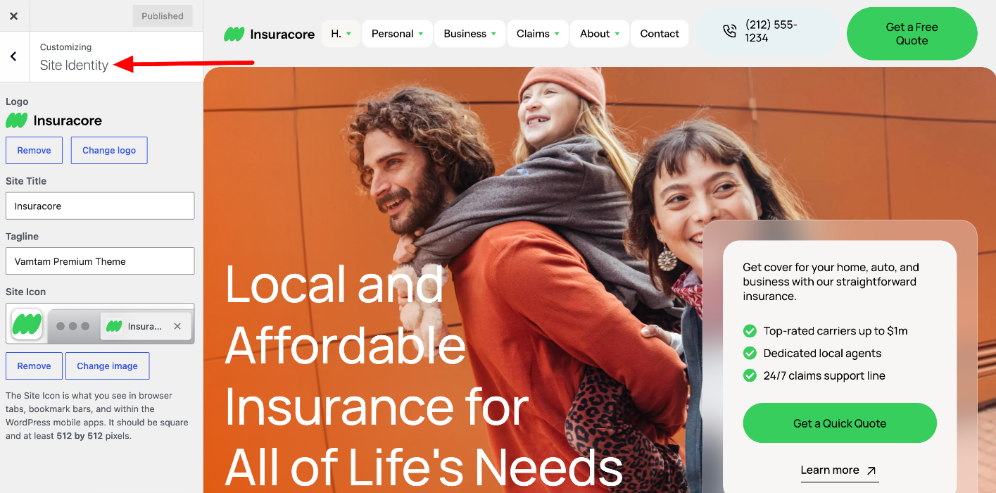
The logo image is set once for the whole site:
- Open Site Settings from the Elementor menu in the top-left corner of the editor.
- Go to Site Identity and upload your logo under Site Logo.
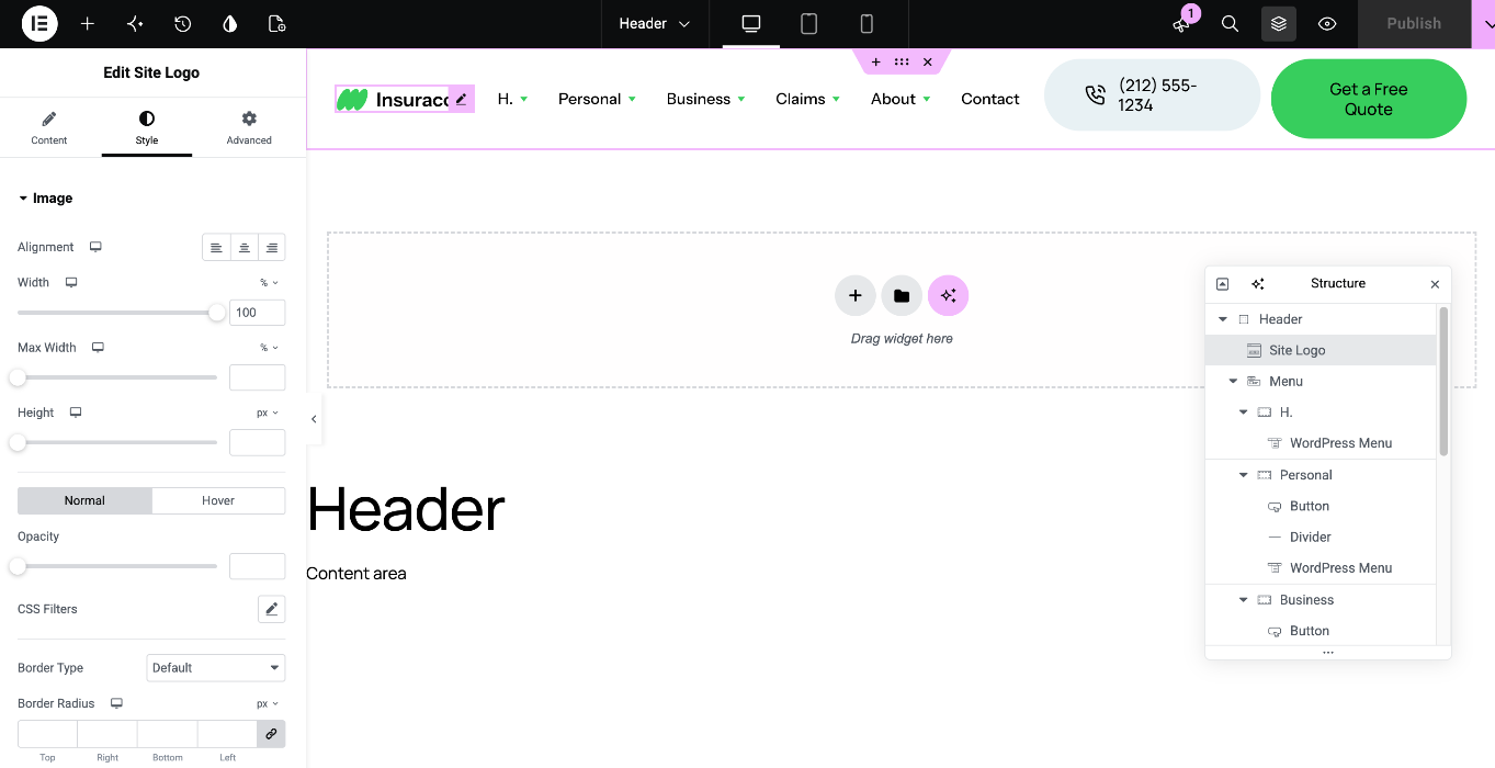
To change the logo size, select the Site Logo widget in the header and adjust the width in its Style tab.
4. Edit the main menu and the dropdowns
Top-level items: select the Menu widget and open Content > Menu Items. Here you can rename, reorder, add or remove items.
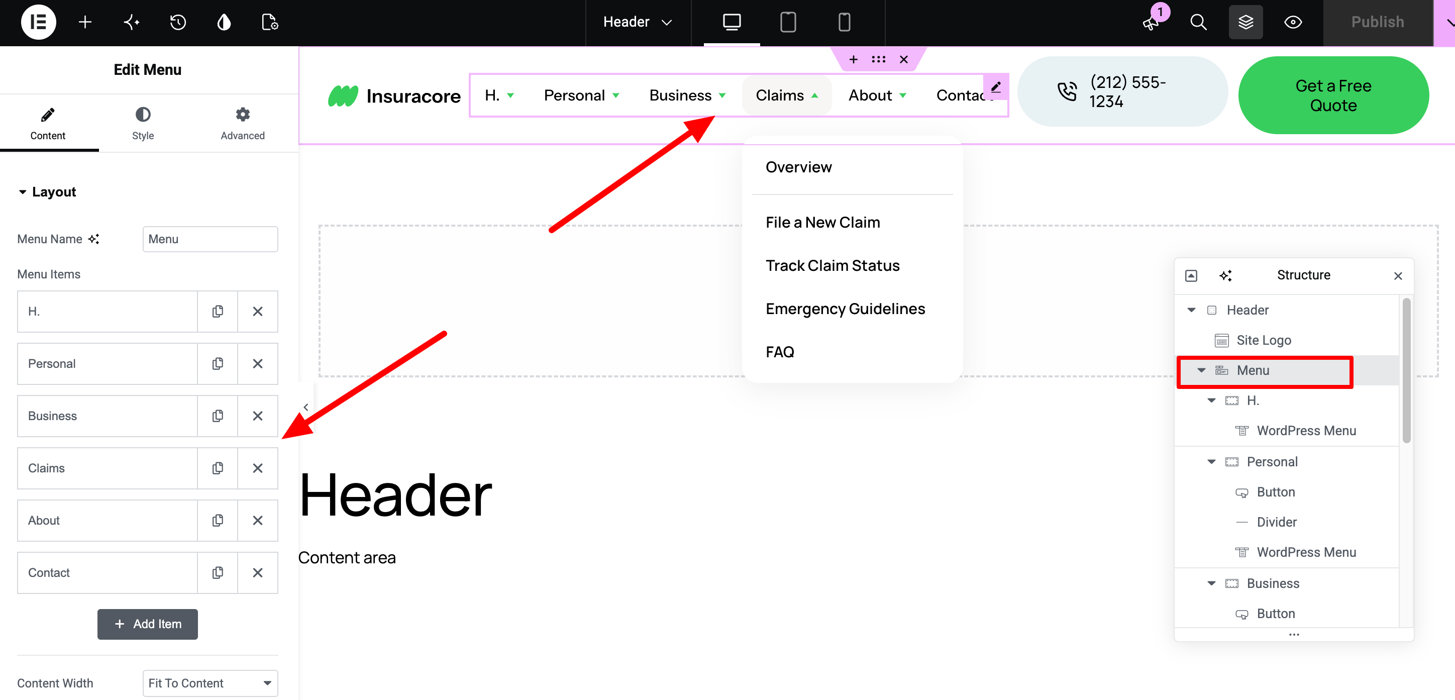
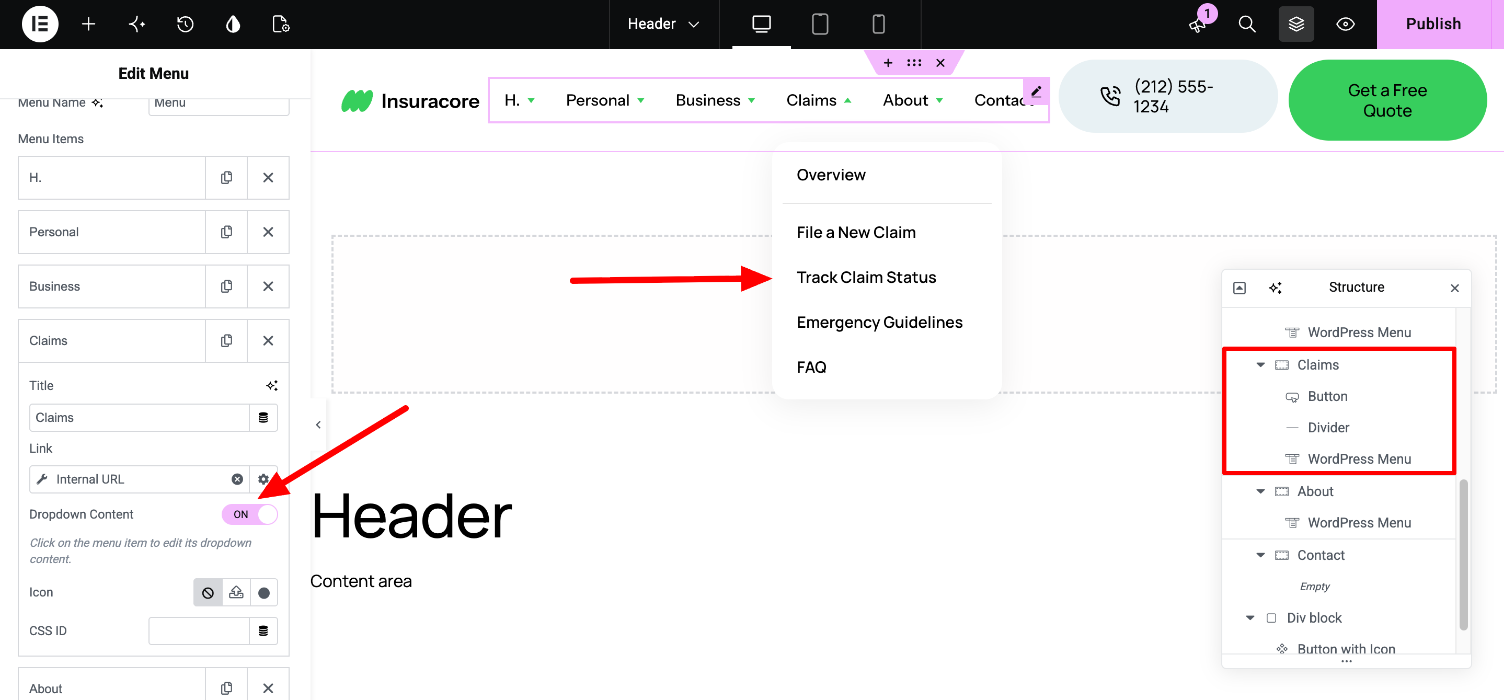
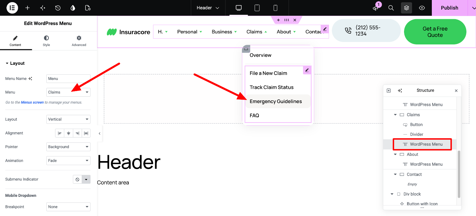
Dropdown content: each top-level item with a dropdown has its own container. Select it in the Navigator. Inside each dropdown you’ll find three things:
- An “Overview” button. Select it to change its text and link.
- A divider.
- A WordPress Menu widget with the list of links.
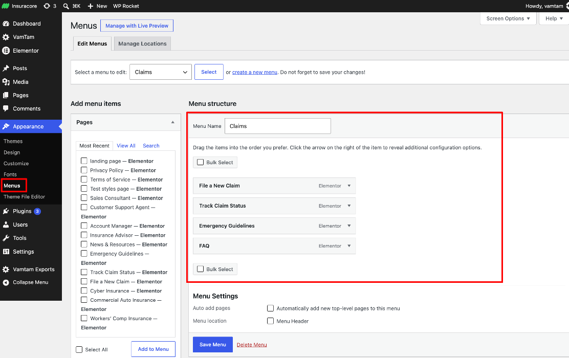
The link lists are regular WordPress menus, so you edit them outside Elementor:
- Go to Appearance > Menus.
- Select the menu you want to edit and click Select.
- Add, remove or reorder links, then click Save Menu.
If you’re not sure which menu a dropdown uses, select its WordPress Menu widget in the header. The Menu field in the widget’s Content tab shows the menu name.
Important: the same menus are also used in the footer. Any change you make to them in Appearance > Menus updates both the header and the footer. If you want different links in the header, create a new menu and select it in the WordPress Menu widget in the header.
5. Edit the phone number
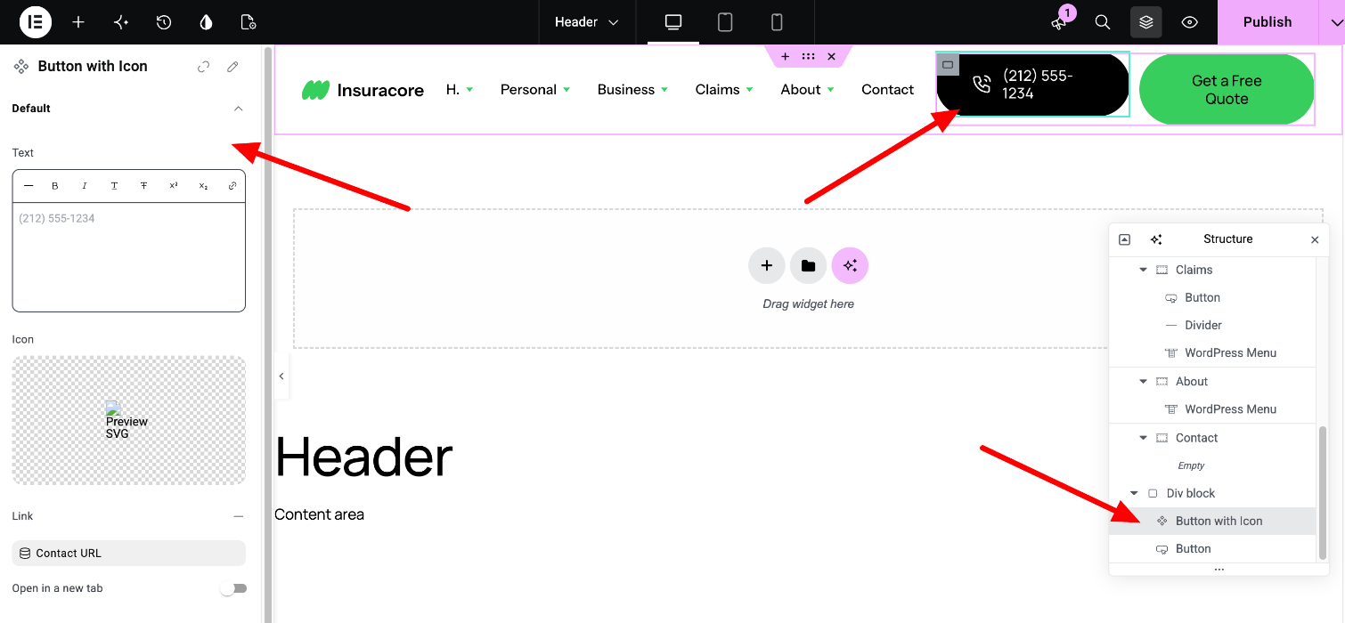
The phone number is a Component called “Button with Icon”. Components are reusable blocks that can appear in several places on your site.
To change the phone number in the header only:
- Select the component in the header.
- In the panel, edit the Text, Link and Icon fields. These changes apply to this header only.
For the link, use the tel: format, for example tel:+12125551234. That way visitors on phones can tap the number to call you.
To change the design of the component itself, double-click it, or right-click it and select Edit Component. This opens the component in edit mode. Keep in mind that any change you make here applies everywhere the component is used on your site. When you’re done, exit edit mode and click Publish. Read more here: https://elementor.com/help/components-2/
6. Edit the “Get a Free Quote” button
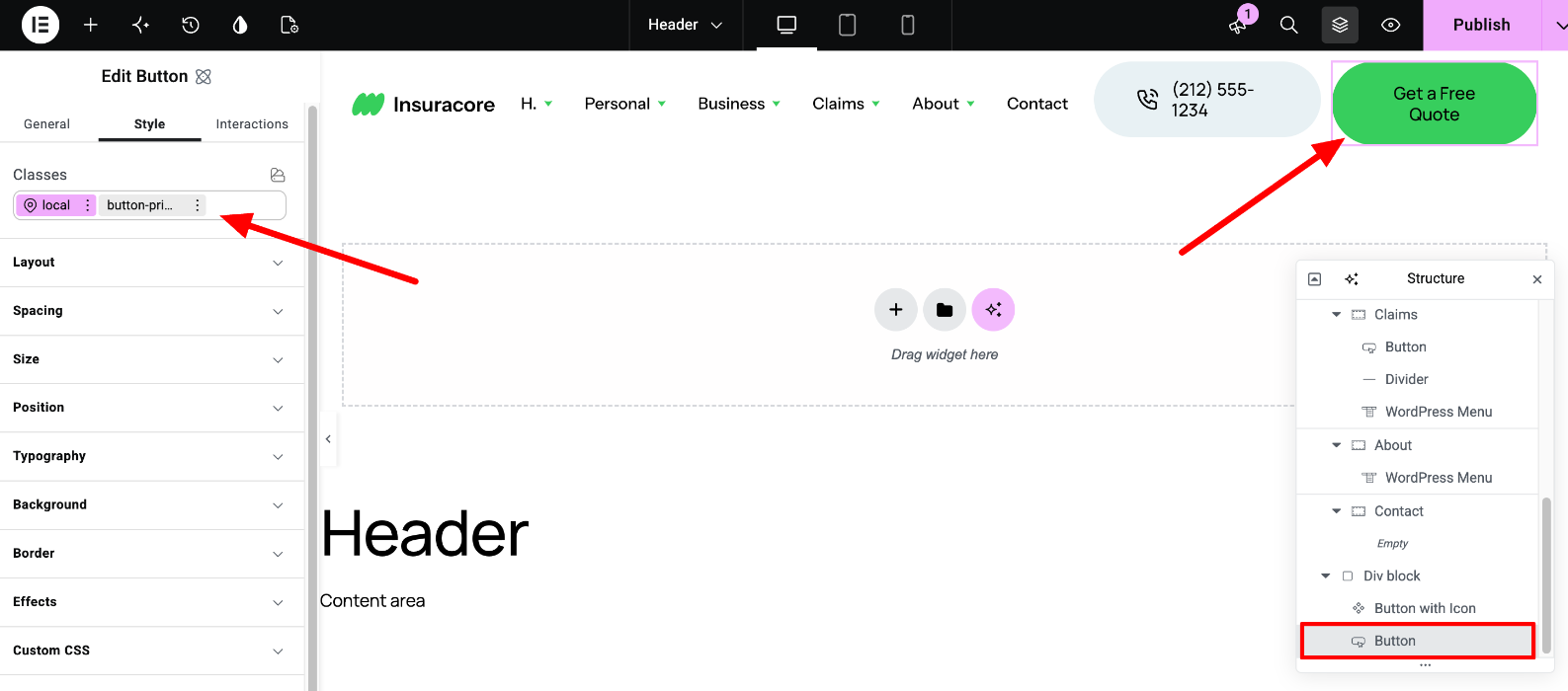
Select the button to change its text and link.
The button’s look comes from the button-primary class, a global style shared by the primary buttons across the site. If you edit the button-primary class, every button that uses it changes. To change only this button, select the button’s own local style in the Classes field before you change any values.
The colors and spacing come from the theme’s Variables. Changing a Variable updates every element that uses it, across the whole site.
7. The header on tablet and mobile
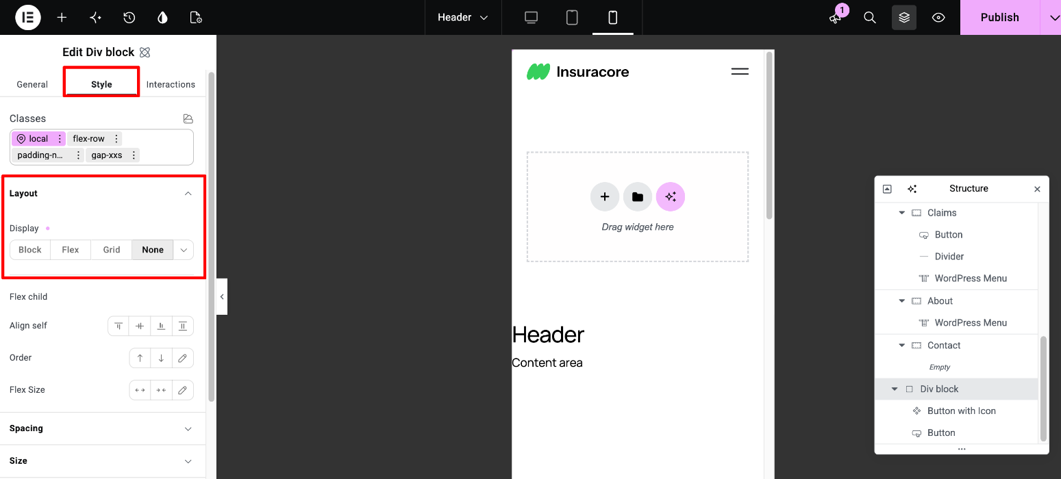
The phone number and the “Get a Free Quote” button are hidden on tablet and mobile. To edit them, switch to Desktop view.
To show them on mobile:
- Switch to Mobile view.
- Select the Div block that contains the two elements.
- In the Style tab, go to Layout > Display and choose any option other than None.
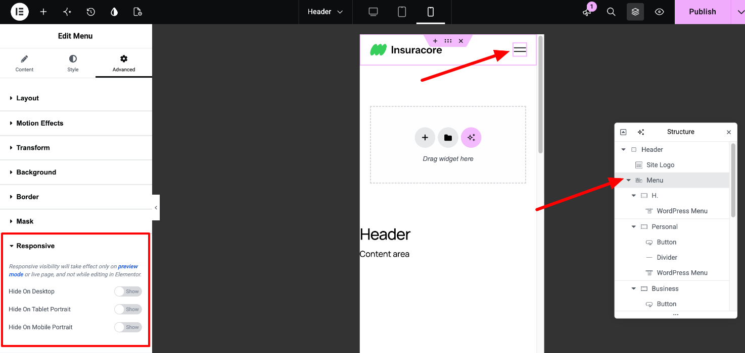
On smaller screens the main navigation collapses into a menu toggle. You’ll find its settings in the Menu widget’s Content tab.
Switch between Desktop, Tablet and Mobile views with the device icons in the editor’s top bar.
8. Save your changes
Click Publish in the top-right corner of the editor.
Related articles
Editing Components in VamTam V4 themes
Design System: Variables and Classes
Elementor - Theme Builder