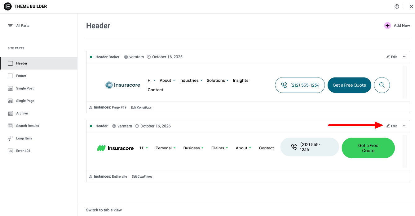
If you have used a classic VamTam Elementor theme before, most of the work will feel familiar: you still edit pages in Elementor, and the header and footer are still in the Theme Builder. What changes is how the elements are built and styled. Our V4 themes use Elementor’s new V4 elements, together with Variables, Classes and Components. This article explains the main differences and where to find the settings you already know.
If you haven’t installed your theme yet, start with the Setup Guide VamTam Elementor V4 Theme.
1. What is Elementor V4?
Elementor V4 is the new generation of Elementor elements, for example Flexbox, Div block, Heading, Paragraph and Button. Instead of styling each widget separately, V4 elements are styled with reusable Classes and Variables, so the whole site stays consistent and is easier to change.
Most parts of our V4 themes are built with V4 elements. A few parts still use classic Elementor widgets (see section 7).
Elementor guide: What are the differences between the Elementor Editor V3 and V4?
2. Find your way around the editor
A few panels and tabs have new names or a new place:
- Navigator is now Structure. To see all elements on the page as a tree, click the Structure icon (layers) in the top bar.
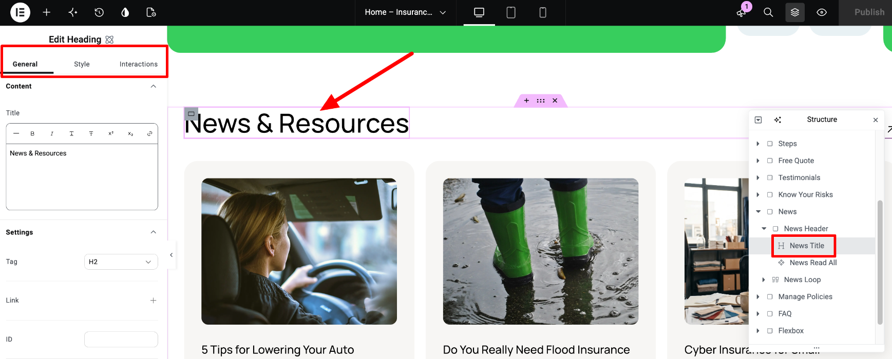
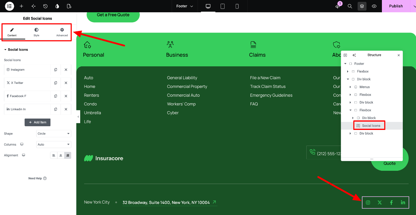
- The Content tab is now the General tab. When you select a V4 element, the panel shows three tabs: General (the content, such as text and links), Style and Interactions. Classic widgets still have Content, Style and Advanced.
- Styles are in one place. All style settings of a V4 element, including layout and spacing, are in the Style tab.
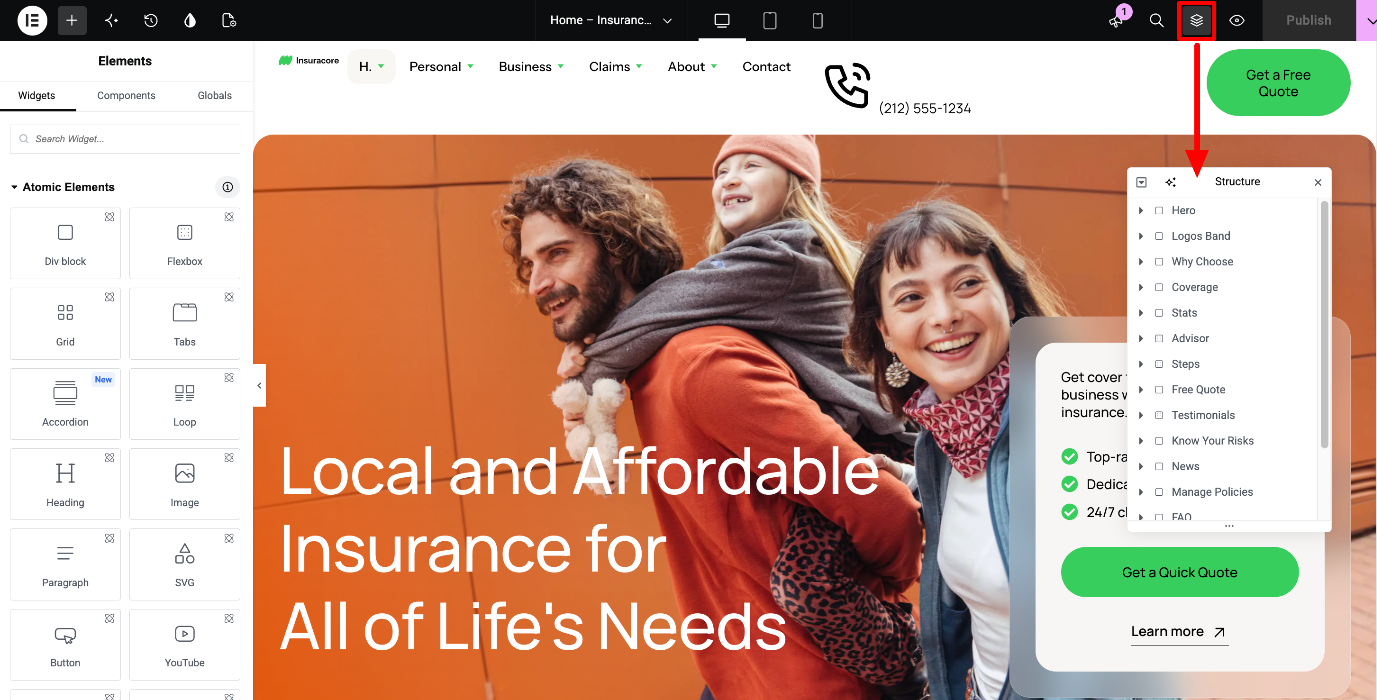
Elementor guide: Use page structure to navigate your page
3. Global Colors and Fonts are now Variables
In classic themes you changed the colors and fonts in Site Settings > Global Colors and Global Fonts. In V4 themes they are Variables, stored in the Design System panel (the Design System icon in the top bar).
The color variables are synced to Global Colors, so the classic widgets in the theme use the same colors. When you change a color variable, both V4 elements and classic widgets update.
To learn how to change the variables, see Design System: Variables and Classes in VamTam Elementor V4 Themes.
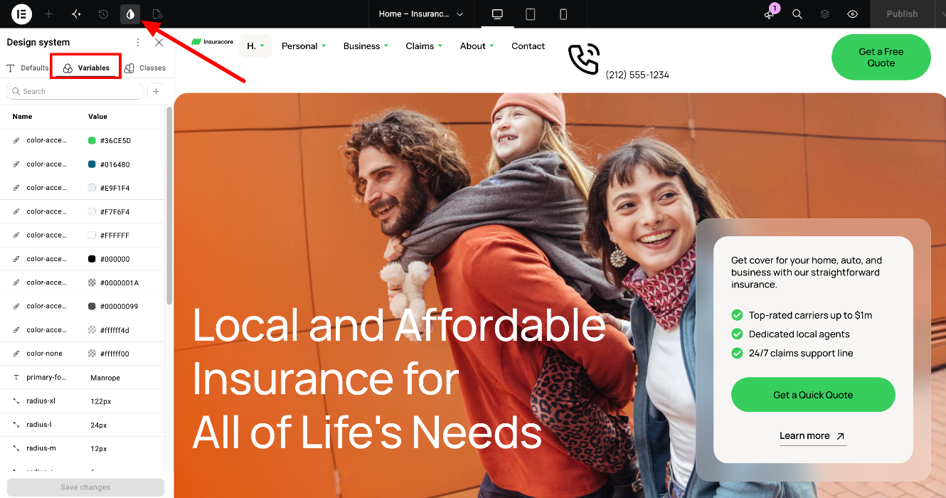
Elementor guide: Variables Manager
4. Theme Style is now Classes
In classic themes the look of headings, buttons and other elements came from Site Settings > Theme Style. In V4 themes it comes from Classes, for example heading-1 to heading-6 for headings and button-primary for buttons. You can find all classes in the Design System panel, in the Classes tab.
When you change a class, every element that uses it changes. This is how you adjust, for example, all buttons on the site at once.
To learn how classes work, see Design System: Variables and Classes in VamTam Elementor V4 Themes.
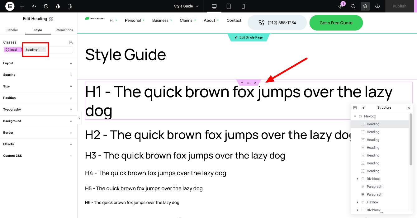
Elementor guide: Classes in Elementor
5. Hide an element on a specific device
In classic themes you hid an element with Advanced > Responsive > Hide On. V4 elements don’t have this option. Instead:
- Switch to the device view you want, for example Mobile, from the top bar.
- Select the element and go to the Style tab.
- Open Layout and set Display to None.
Do this on the element’s local class (highlighted in pink in the Classes field). If you do it on a global class, every element with that class is hidden.
The element is still listed in the Structure panel, so you can select it there and show it again.
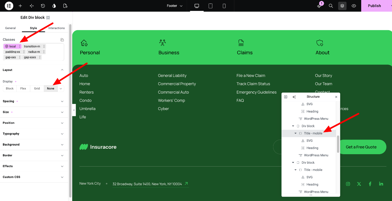
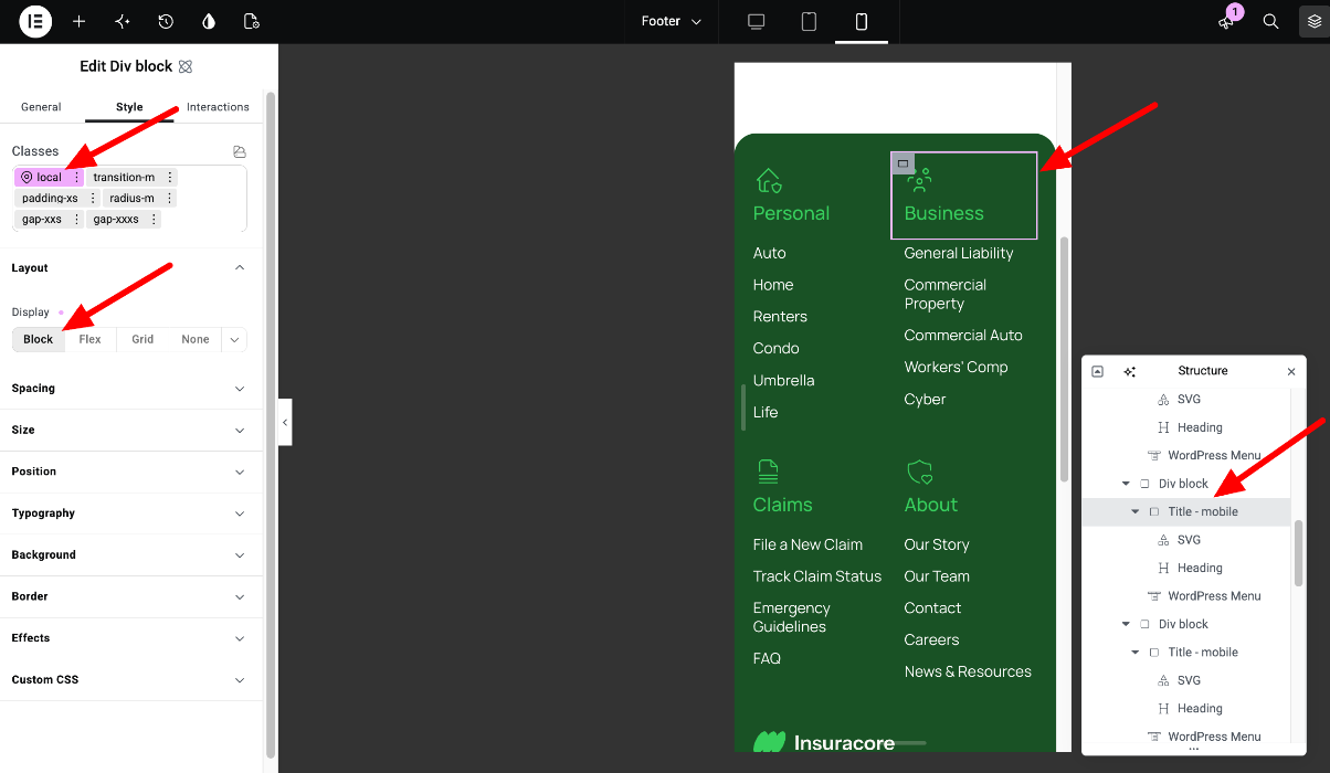
Elementor guide: Responsive editing
6. Reusable sections are now Components
Many repeating parts of our V4 themes, such as buttons, cards, banners and forms, are Components. A Component is built once and used in many places. When you edit the Component itself, all copies change. You can also change the content of a single copy without affecting the others.
To edit a Component, double-click it, or right-click it and select Edit Component. Editing Components requires Elementor Pro and administrator rights.
To learn more, see Editing Components in VamTam Elementor V4 Themes.
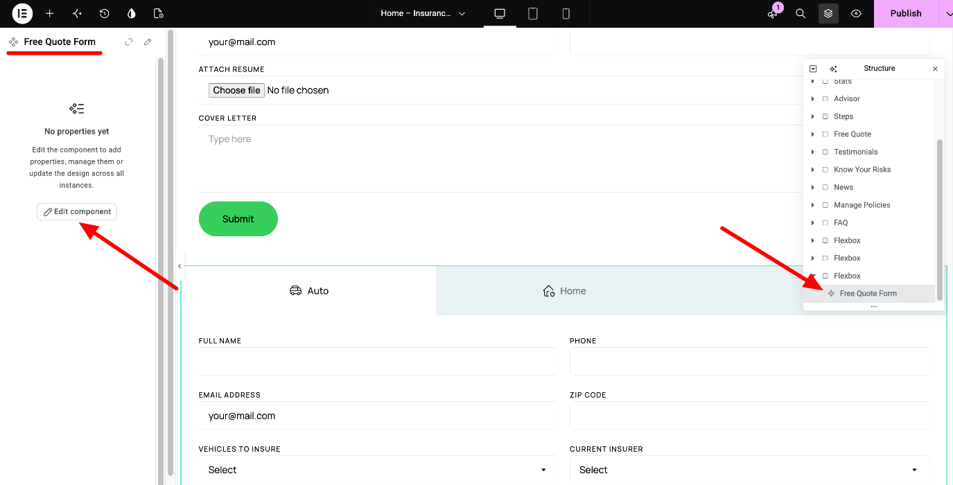
Elementor guide: Components
7. Some parts still use classic widgets
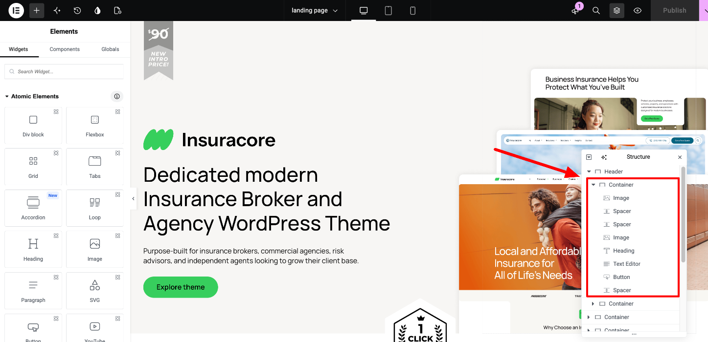
A few parts of our V4 themes still use classic Elementor widgets, for example Site Logo, Menu, WordPress Menu, Social Icons, Icon List, Carousel and Call to Action. You edit them the same way as in classic themes.
To tell them apart, select the element and look at the tabs in the panel. Classic widgets have Content, Style and Advanced. V4 elements have General, Style and Interactions.
The landing page included with the demo (/landing-page/) is built entirely with classic widgets and is used to present the theme. If you don’t need it, you can delete it.
8. See everything on the Style Guide page
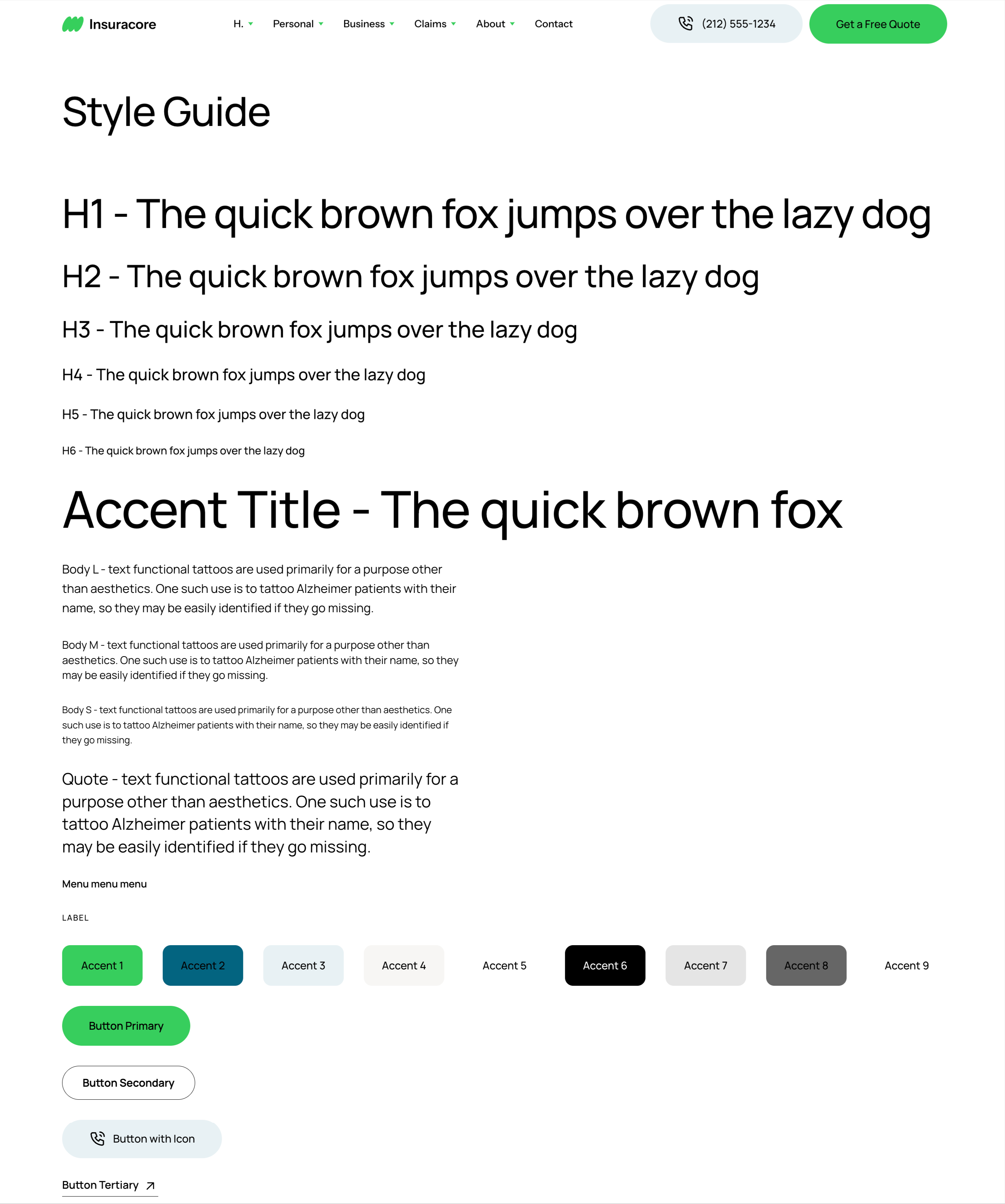
The demo content includes a Style Guide page (/style-guide/) that shows the headings, paragraphs, the Accent 1-9 colors, the buttons, the spacing scale and all components of the theme. Use it as a quick reference while you get to know the V4 theme.
9. What stays the same
- Theme Builder. The header, footer and other templates are still in Templates > Theme Builder. The Display Conditions are behind the arrow next to the Publish button.
- Pages and content. You still edit pages with Elementor, and the theme still requires Elementor Pro.
For InsuraCore, see InsuraCore Elementor V4 Theme: How to edit the Header section? and InsuraCore Elementor V4 Theme: How to edit the Footer section?